Friday, 25 November 2016
The Art of Mistakes Interview with Melanie Rothschild
Self taught artist who never thought she was very good at art.
After graduating from college she felt relaxed and had intentions of just 'playing'
She used her anthropology design references in her head to inspire her to be creative
Started off with frames that she had from her family business - designed them and sold them
Went to a few art classes and always felt like she was the worst in the class
She calls her techniques the 'Gorilla techniques' - things that she stumbled across on her own and made up
'The tool of my trade is mistakes'
Originally used dots on her frame designs to cover up the mistakes
'Mistakes for me are guide posts to ideas i never would have come up with'
I find it interesting that she talks about the idea of feeling accepted. with the encouragement of making mistakes, it allows people to feel accepted and welcome to the 'art table'. I feel like there are a lot of rules and restrictions with art which create huge amounts of pressure so the enforcement of mistakes allows people to feel more comfortable in creating art.
Image, Idea, Context
Making Mistakes
Making mistakes - learn from them. You do the whole process again, so you are developing new skills and becoming more skillful. Opposed to digital where you literally press the undo button. You are not necessarily learning and getting a greater understanding of the process.
What makes analogue illustration more interesting than digital?
Mistakes are important its how you learn from them.
Jackson Pollock compared with Roy Lichtenstein - the paint splat made into something digital.
Melanie Rothschild
Accidently spilled a whole gallon of paint into her workshop. When it dried she was able to peel the whole thing off. She then became obsessed with spilling paint, letting it dry and peeling it off. She became obsessed with the idea that mistakes lead to new ideas. Setbacks along the way can be a catalyst for new ideas and adventures.
Winston Churchill - 'success is going from failure to failure without loss of enthusiasm.'
'Goal mistakes' - choose purposely to take a risk, for success, coaching and trial and error.
Image analysis
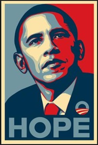
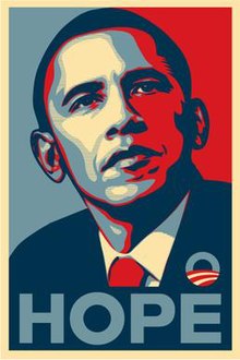 Shepard Fairey - Obama 'Hope'
Powerful colours - red symbolising importance. this is contrasted with the shades of blue which perhaps shows juxtaposition between that and the text 'Hope'. Blues are usually associated with quite sad emotions. The face is half and half perhaps suggesting the look into the future but shadowed by the past? Or I guess it's just the American flag split into the two states - Democrats and Republicans. Produced in 2008 for the Barack Obama presidency campaign.
William Morris - Trellis Wallpaper.

Inspired by the gardens at red house. Colour are quite subdued and restricted. Washed out. Mediaeval. 19th Century. Reaction to the Industrial revolution - hand made painting. Infatuated by nature and authenticity.
Images that relate to my quote


I looked at both digital and analogue concepts when searching for images. I wanted to see the comparison between digital and analogue art. I stumbled across a few really interesting pieces of work, like Melanie Rothschild who creates objects with dried paint, from her initial 'mistake' when she accidentally spilled paint on her floor. I discovered that a lot of modern festival sub culture posters are screen prints (analogue style) which shows that the younger generation are starting to be really drawn by the niche, unique, redundant style of art which suggests it will come back into fashion.
Finding Sources of Information
LCA Library
Source 1 - book 'The Craftsman' 306 SEN - Richard Sennett.
The book is quite engaging and relevent a lot of knowledge and opinions. I used the LCA Catalogue library.
Source 2 - 'Understanding digital culture' - Vincent Miller 306.24. Book, LCA Catalogue.
Source 3 - 'Lomo Life - future is analogue' 779 - this book backs up the quote quite well, so it is a very useful source of information.
Google Books (preview)
Source 1 - 'film is not dead' Jonathan Canlas + Kristen Kalp. Internet.
Source 2 - Dialogue - Anders Soman-Nisson
Source 3 - Real Academy - Robert Allen Bartlett
Websites
Source 1 - Introduction to digital photography - differences between analogue and digital.
Source 2 - Melanie Rothschild: The Art of Mistakes.
Source 3 - the art and science of mistakes.
Wednesday, 19 October 2016
Quote Analysis
Technology - 'The alchemy of the analogue is more unpredictable, and therefore more alluring.'
The process of making something is sometimes unknown (film camera) so things can easily go wrong, as apposed to a digital camera - images that can instantly be seen and edited there and then - you gfet more of an authentic natural interesting looking outcome. Some digital lose a real sense of realness as they are constantly being bombarded with Photoshop techniques, making the image somewhat unrecognisable to the original one. You cant control the process therefore seeing the outcome becomes more exciting.
Analogue definition: structurally similar to something but differs in composition.
Alchemy meaning: Tradition practised throughout Europe
Analogue vs Digital
Analogue equates to 'Lo Fi' Low Quality
Practitioners who received their degrees in the pre digital era, they are more drawn to technology than the younger generation because they have grown up with computers and are used to that life.
Impatience is the topical term in our digital age.
People believe that Digital life will help us live in a more fluid efficient manner. We experience information overload. Always hitting that 'upgrade me now' button as there is that expectation that it is going to be better but there is always some kind of disappointment. The thing is with film, you cant be impatient with developing a film because it has a time-delayed process. With film you can create 'Happy Accidents.'
There is such thing as 'Beautiful losers' for example Shepard Fairey. He produces advertising campaigns (Obama 'Hope') But there is major irony as he exploits digital self publishing, despite employing working methods which are analogue. This creates a dilemma and a contradiction in this phenomenon.
Everyone can do non analogue stuff because it is easy accessible and found everywhere (ubiquitous).
Also everyone can do it and there is no distinction.
Lecture 2 - A 20,000 year non linear history of the image
What I found very interesting about this lecture is how we see certain Images. The significance and power of certain pieces of art, why they are so powerful and how they become less powerful. I began to understand the importance of knowing an artists background to really engage with the piece of art work. With the Mona Lisa painting, It's not a particularly emotional painting, There's no real concept behind it and you cant really engage or relate. So why is this painting so notorious and so significant? The artist? Leonardo Da Vinci. Perhaps the gallery it is exhibited at in Paris. The amount of people queing to see it? One of the big reasons is the fact we are told it's powerful. With the digital age, it creates opportunities to take art and reuse, recycle them, do exciting experiments and transfer these pieces of art onto various items or clothing - It is no longer in the artists control and so therefore the orginal painting instantly becomes more precious,
Wednesday, 12 October 2016
Studio brief 1
For our first task we were given a sheet of quotes and were asked to choose one and analyse it. In our group we chose a History quote: 'The history we read [...] though based on facts, is, strictly speaking, not factual at all, but a series of accepted judgements.'
So what this quote is actually trying to say is that we don't actually know for certain the facts we read today are infact 'facts' Most of what we read are seen through the eyes of different people and so therefore is biased. There are right/left wing views, class and much of early history books are written through the white man.
Some key terms: 'accepted judgement'. What is a fact? 'a thing that is known or proved to be true.'
In the American history books, Columbus comes across like a hero when in actual fact he slaughtered the land. History written by the victors - written by the majority of white males. Propaganda. Joe Sacco 'The Great War' illustration book.If he wasn't there himself he is accepting judgement. The film Stone wall about the LGBT riots, the film portrays a white man when actually the original story is a black trans. There is a difference between films and news, where films are edited to attract viewers.
America called the Vietnam war the American war. North Korea illustration article - someone that had escaped.
Lecture 1 - Visual Literacy - Language of Design
This first lecture was about logos and symbols and how they are used to represent something major.
What I found very interesting is how aspects from a variety of logos are the same but are easily distinguishable due to certain colours or slight alterations. For example a simple black cross could potentially mean first aid, Church, Pharmacy, Plus, Add. When you start to introduce other symbols which correspond to one another, it gives a context. So adding Mathematical symbols for example, you would instantly recognise this as an 'add' symbol. Stretching the cross out then starts symbolising religion and Jesus and then when you start adding colours like green, it means pharmacy or first aid. I just find it really interesting how one single shape is used for so many different logos and stands for so many different things.
For any language to exist there must be an agreement that one thing will stand for something else.
We learnt about Visual Syntax - a pictorial structure, representing basic building blocks of an image that affect the way we read it. Colour has a huge impact.
Visual Synecdoche - the concept of taking part of something to represent a whole. Only works if the image is universally recognised. For example the statue of liberty representing New York.
So in conclusion, every object has the capacity to stand for something other than what is apparent.
Sunday, 9 October 2016
Exercise 1
For this task we were focusing on 5 different themes within context of practice. Politics, History, Technology, Culture and Aesthetics. We had to pick two categories and come up with 10 words on each sheet for each. We then swapped one of our sheets with someone else's. From these two sheets we then combined two words and conveyed an idea which visually communicated the two words.

Combinations of Punk with Technology.

Electricity with Punk.


Subscribe to:
Comments (Atom)